Kaup seed and fertilizer
About project
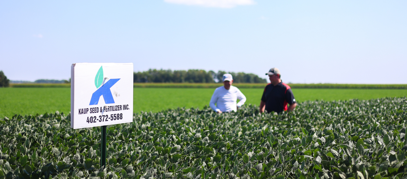
For Kaup Seed & Fertilizer, the refresh wasn’t about chasing trends, it was about creating a visual identity as precise and intentional as the work they do in the field and telling that story.
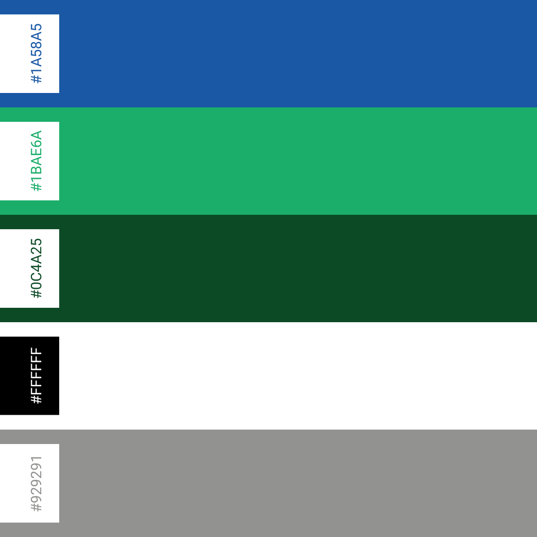
We created a series of videos along with a brand system that enhances clarity and confidence at every touchpoint. Clean layouts, precise typography, and a bold color palette showcase the professionalism and innovative expertise in their agronomy field.
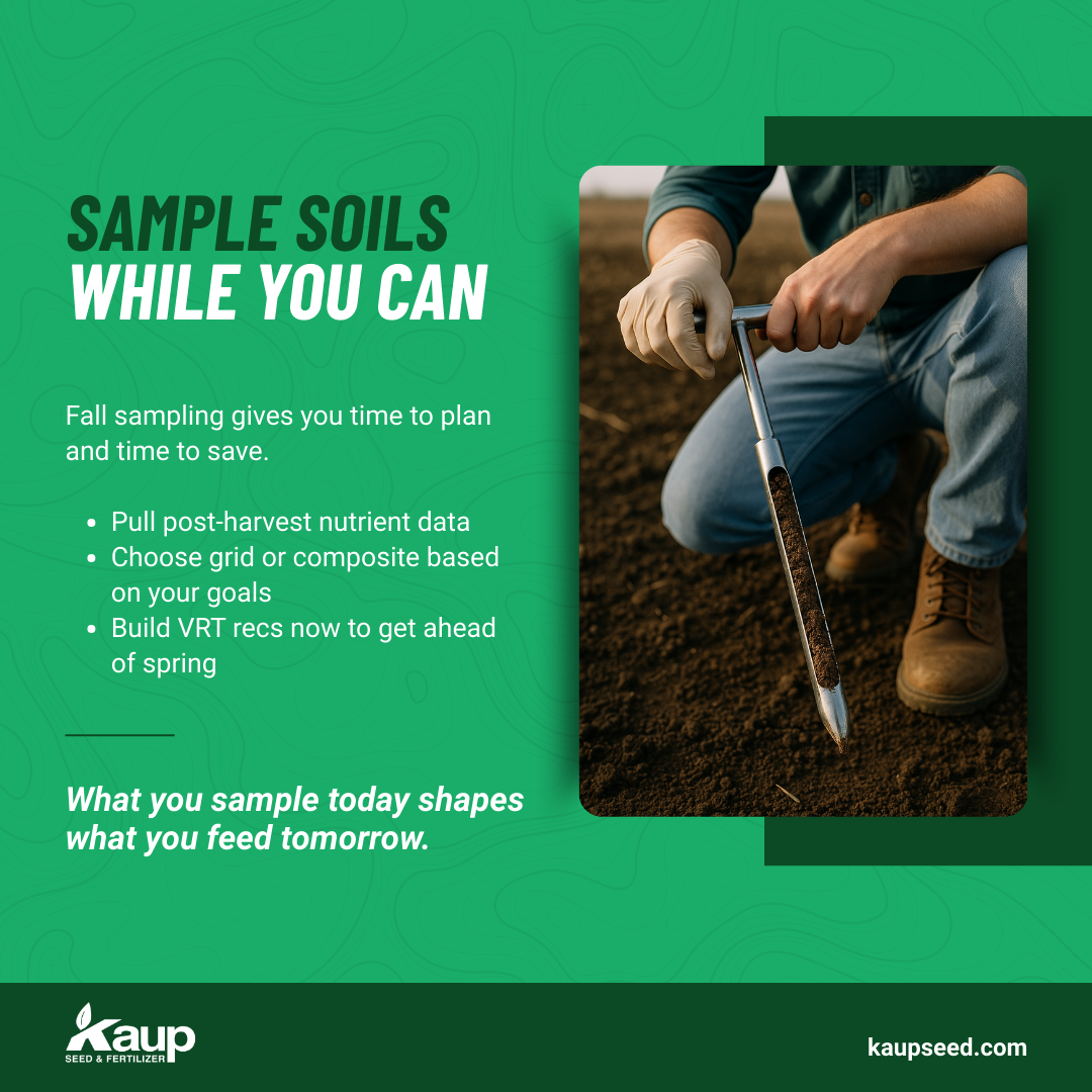
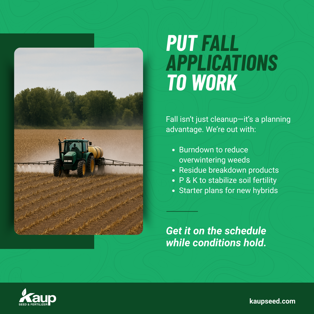
The standout? A custom topographic pattern inspired by grid soil sampling — a nod to their profit zone strategy and precision ag services. It's more than a graphic — it’s a visual language that shows they don’t just sell seed and fertilizer… they map success, acre by acre.
Media
BRand IDentity
SOCAIL MEDIA


Thank You!
Want to see more work like this? Go to our work.
Ready to free up your time and grow smarter?